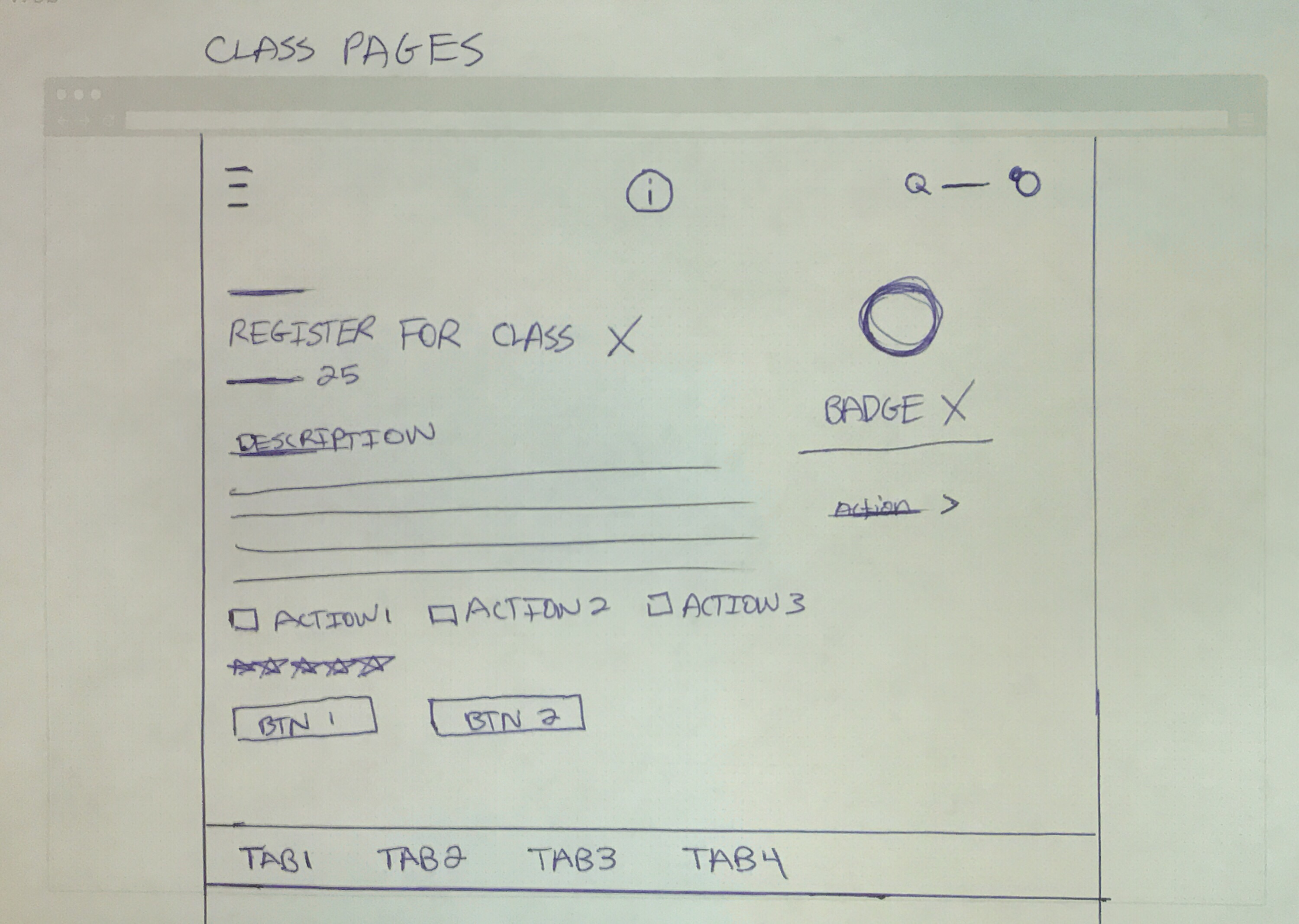
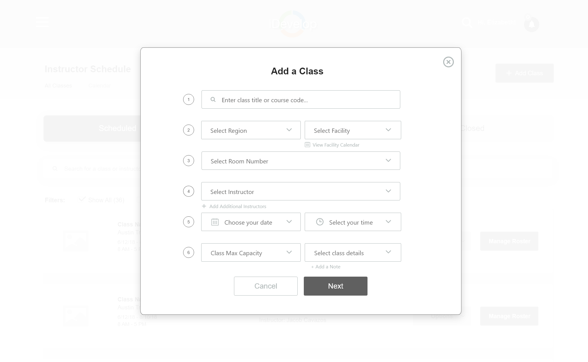
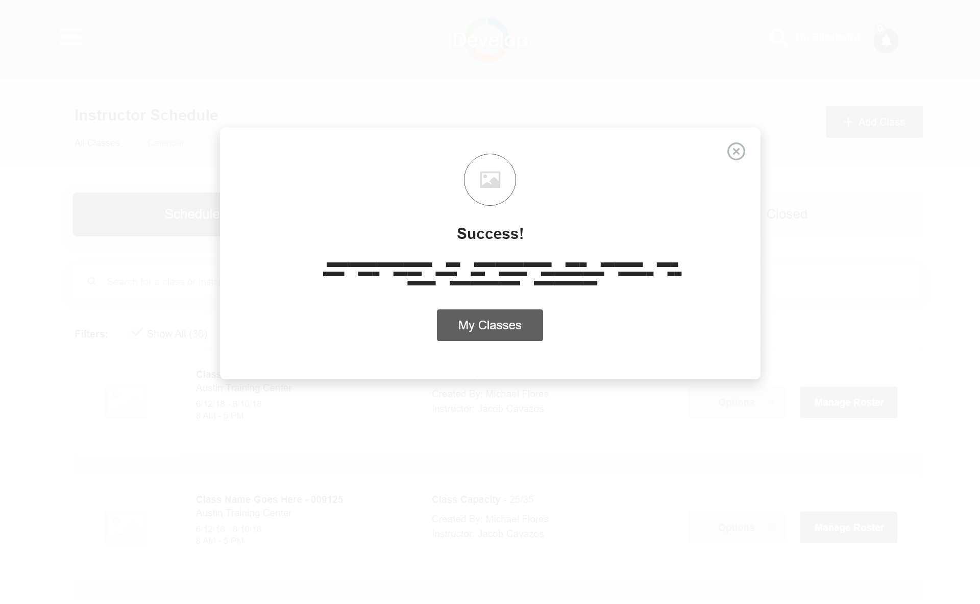
The Product Owner wants to create a user experience for a Partner to register for a class in iDevelop. Partner's should easily be able to search for a class and be rewarded upon their successful completion of a class. As an instructor I need an easy to use system so that I can manage and create classes that I teach and can close out the roster once complete from iDevelop. The Experiences for users should also be enhanced, on all devices, for projects assigned through Wrike.
User Experience Designer
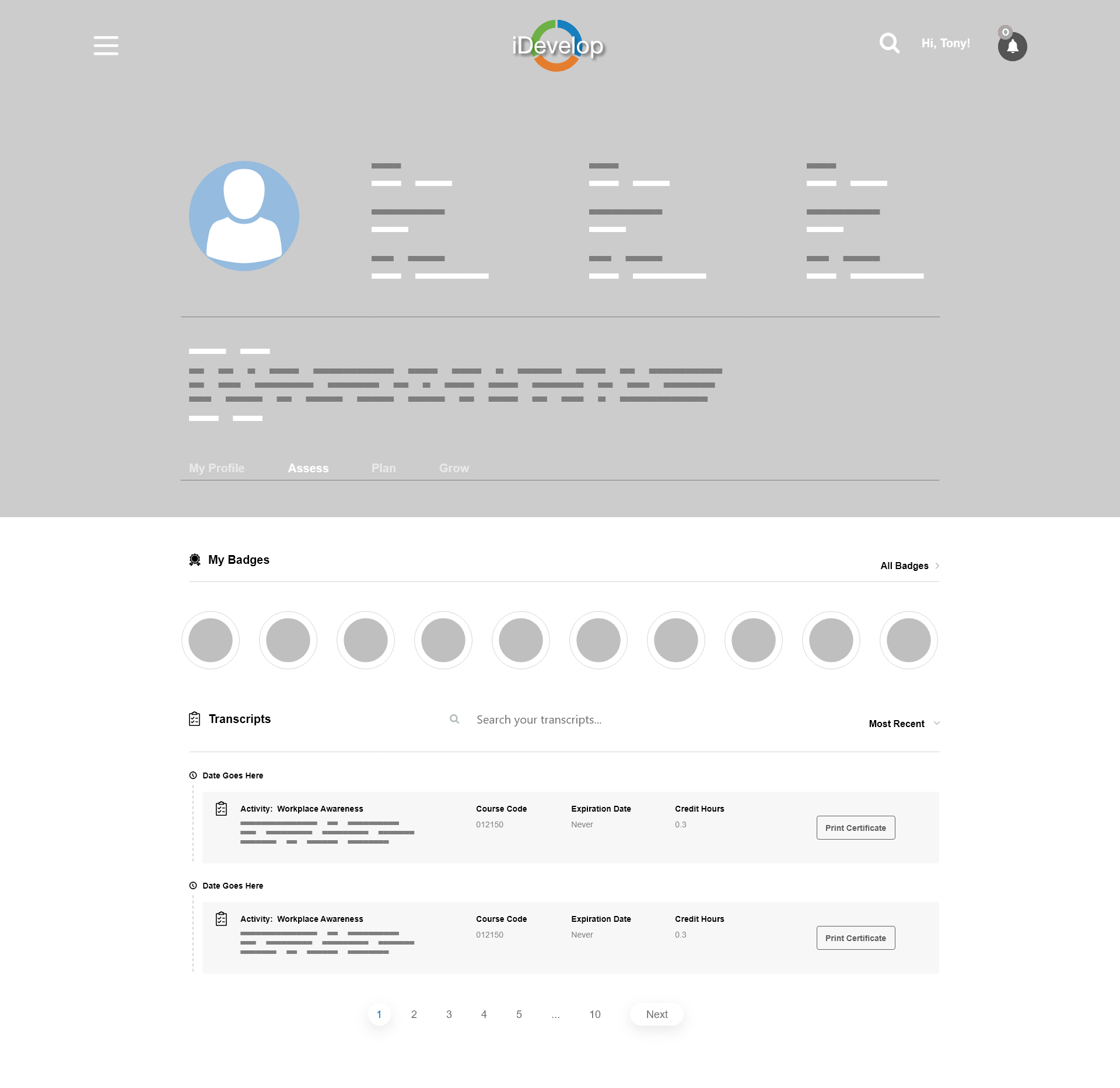
Create a registration process for H-E-B Partners
Redesign user profiles, search and mobile landing pages
Develop responsive websites in Webflow to help aid developers.
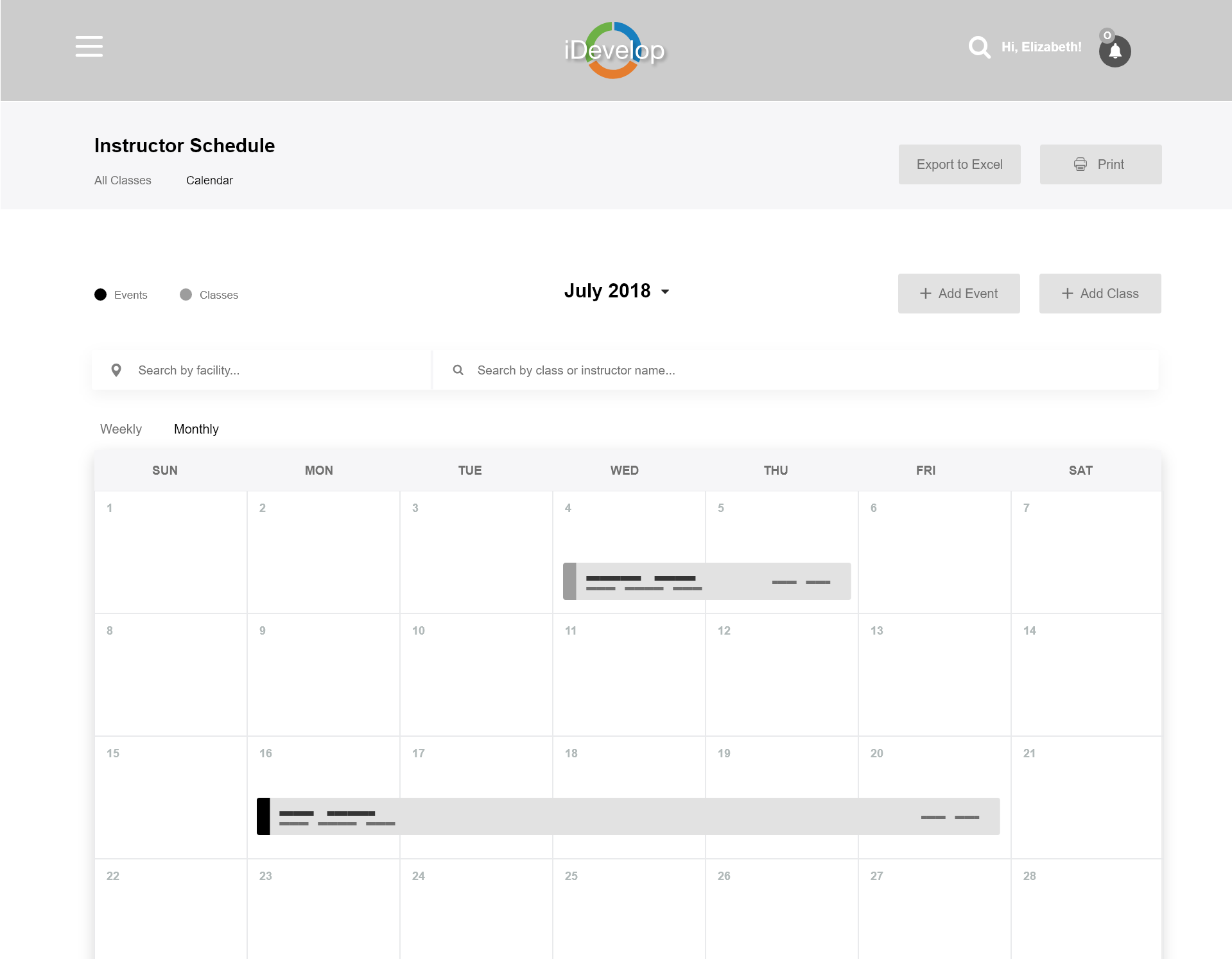
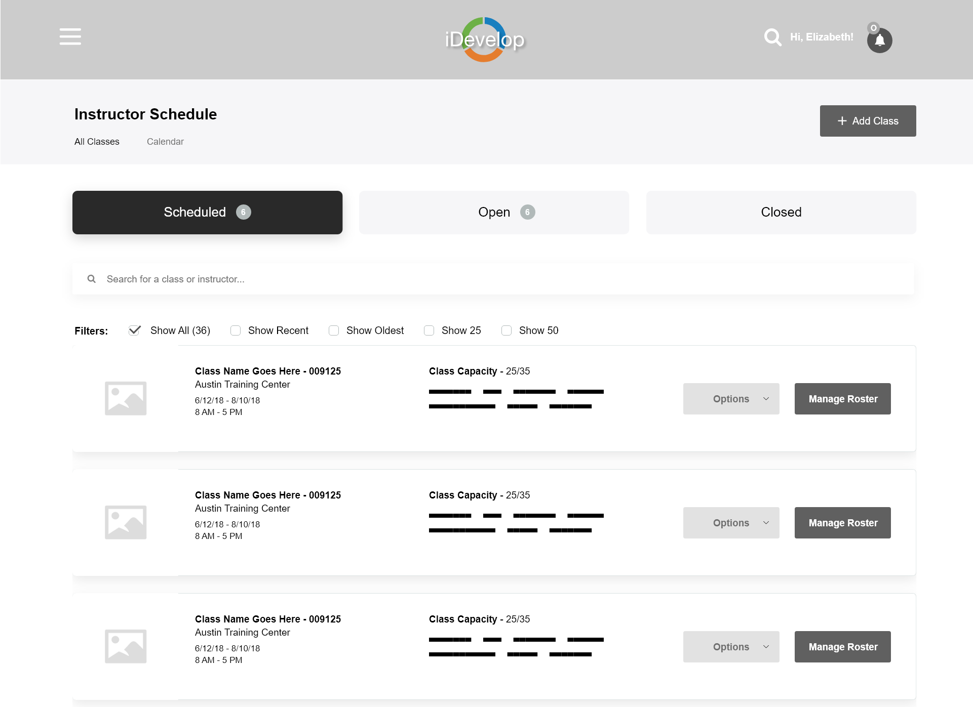
Create a dashboard for H-E-B Instructors with my talented coworker Elizabeth Sukup.
H-E-B Partners
Course Instructors
People with a passion for learning
To improve the online experience for all of H-E-B's current iDevelop Users across all devices. Instructors faced a difficult time with managing and registering partners online for on the job training courses.
June 4th, 2018 - August 2019.
Search Enhancement
Partner Registration
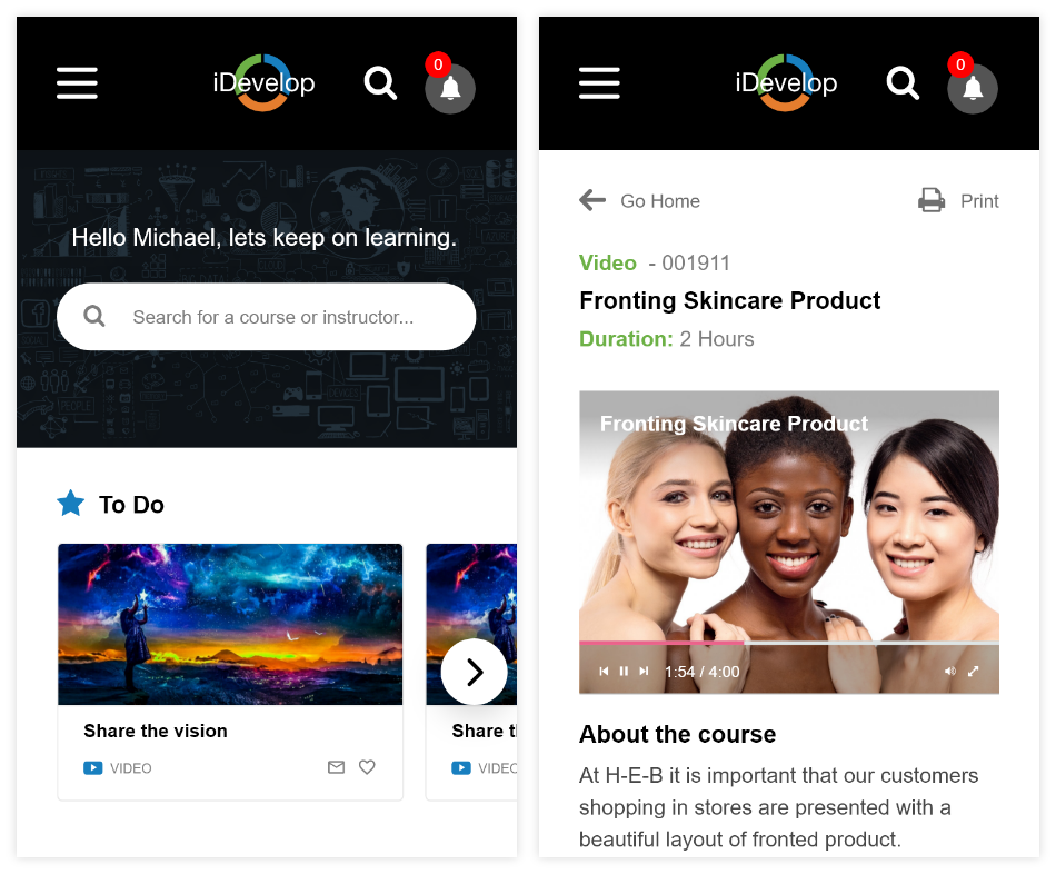
User Profiles & Resource Pages
Instructor Dashboard
Mobile Home Page & Checklist
Adobe Experience Design
Webflow
Wrike (Project Management)
Sketchsheets.com
iDevelop is H-E-B's new learning platform that is in in the process of becoming their leading Talent Development tool. It will be available for all 160,000+ H-E-B Partners so that they can learn and grow within the company. Here Partners will take their required courses, but also be able to search for other courses that might appeal to them.
H-E-B is an American privately held supermarket chain based in San Antonio, Texas with more than 350 stores throughout the U.S state of Texas, as well as in northeast Mexico. The company also operates Central Market. As of 2018, H-E-B is ranked #12 on Forbes America's Largest Private Companies.
The Product Owner wants to create a user experience for a Partner to register for a class in iDevelop. Partner's should easily be able to search for a class and be rewarded upon their successful completion of a class. Additionally, as an instructor I need an easy to use system so that I can manage and create classes that I teach and can close out the roster once complete from iDevelop.
All H-E-B employees are called Partners. As of 2018, there are currently 160,000 active partners serving customers in both Texas and Mexico.
Grocery
Bakery
Human Resources
eCommerce
Public Affairs
Procurement and Global Sourcing
Quality Assurance
Administrative Support
Advertising and Marketing
Data Analytics
Finance and Accounting
H-E-B Own Brand
Information Technology
Legal & Compliance
Real Estate
Loss Prevention & Security
H-E-B Careers Website
https://careers.heb.com/corporate
Website:
http://heb.com/
Facebook:
https://www.facebook.com/HEB/
This part was very important for my learning process about how other companies tackle eLearning Platforms. I wanted to see what a few companies have been doing so that I can see what works and what doesn't. There are plenty of companies out there right now that could offer our team some great inspiration to get started.

A global marketplace for learning and teaching online where students are mastering new skills and achieving their goals
Widely known and most used eLearning Platform on the market.
Beautiful UI and color scheme.
Student and Instructor Capabilities
Course Reviews and Light UI
Instructor notifications are big.
Recommended categories are in plain sight and is a great feature to have.
Lacks student plans and only offers individual courses
Courses are not free like iDevelop will be for Partners.
We envision a world where anyone, anywhere can transform their life by accessing the world's best learning experience.
Website is Responsive and has a light UI.
Login popup modal is nicely design and has tabs for logging in and signing up.
The live search feature is a nice experience.
Showing the schools on the landing page helps build trust with potential users.
Signing up is very easy with social integration.
Footer is very crammed. Needs more padding.
Explore dropdown shifts the entire page a few pixels over
Keep up with technology with expert-led courses, assessments and tools that help you build the skills you need, when you need them.
Website has an interesting design style and layout.
Offers a 10 day free trials for users to test out their product.
Offers pathways, similar to what H-E-B's iDevelop will offer their partners.
The search updates on the fly giving you the option to choose course or path.
Course details, levels, ratings, duration and curriculum are shown.
Dark UI
Very pricey once your trial ends, even for the individual plan.

LinkedIn's very own personalized learning experiences, courses taught by real-world professionals.
Integrated with LinkedIn User Profiles.
Light UI and color scheme.
Free trials are offered to LinkedIn Users.
Recommendations, In Progress, and Saved Content on landing page.
Offers individual courses as well as Learning Paths.
Gamification (Badges, Progress Bars etc.)
Once trial ends you pay up to $299.99/yr
Landing page banner seems very crammed together.

We envision a world where anyone, anywhere can transform their life by accessing the world's best learning experience.
Light UI with interesting gradients.
A lot of courses are free to watch.
Course pages have a description and curriculum displayed.
Very inexpensive at $9.00/month.
Run by a very helpful and popular YouTuber named Gary Simon.
No context is given to the courses listed at the very top.
Search works by exact title only.
No learning paths offered.
Keep up with technology with expert-led courses, assessments and tools that help you build the skills you need, when you need them.
Mixes a dark and light UI very well.
Users are given a free month trial.
Great use of tabs on the landing page.
Course and path pages are beautifully designed.
Users can take notes during the course.
Integrated with and owned by LinkedIn.
Once the trial ends you pay $25.00 - $30.00/month
No public rating system for Instructors.
Creating the rough sketches enables me to get my ideas in my head down on paper so that I do not forget. Thanks to a place called SketchSheets.com they allow me to have access to almost every device on paper. This makes it much easier for when I bring it into design programs for the next stages.
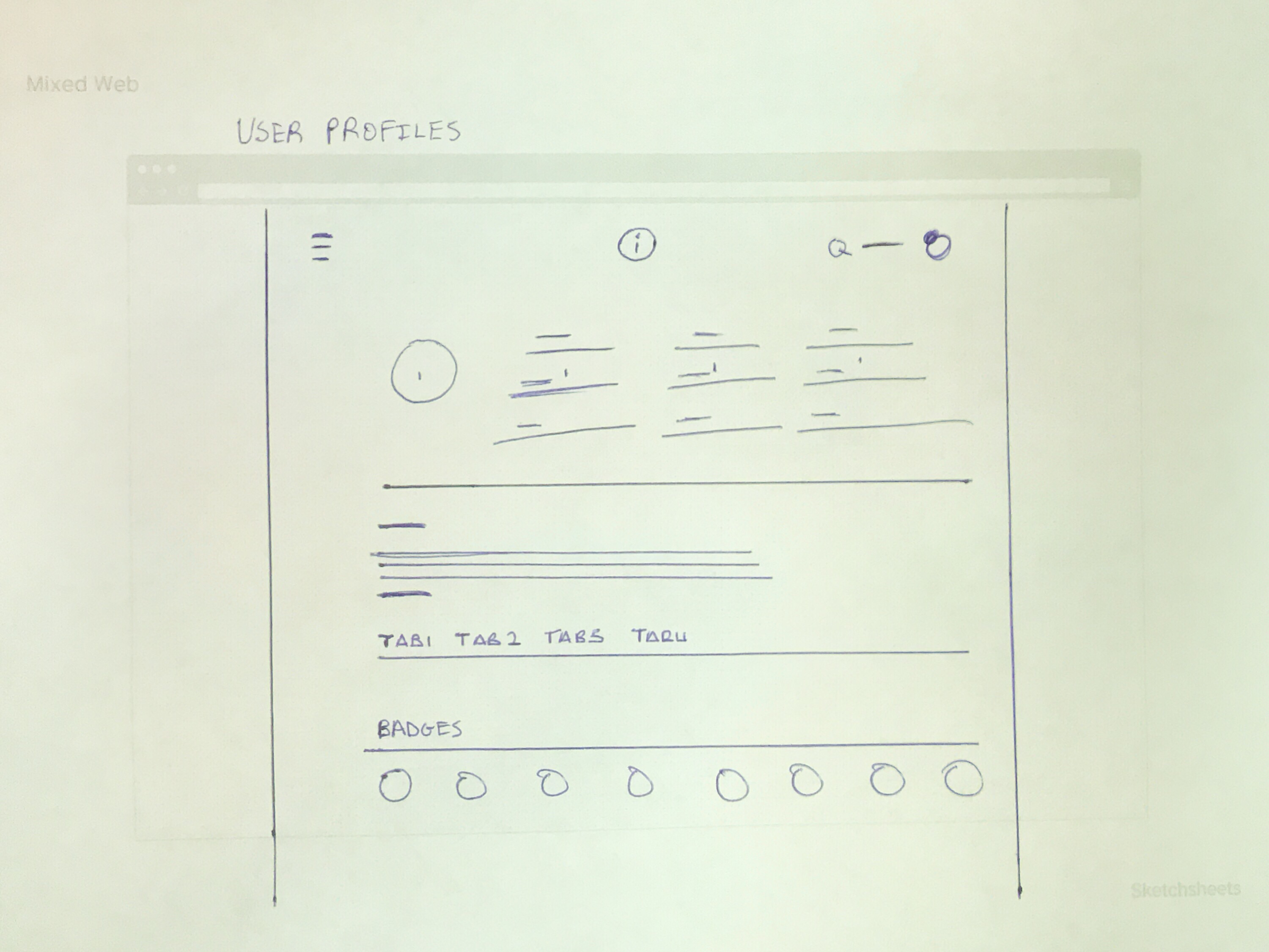
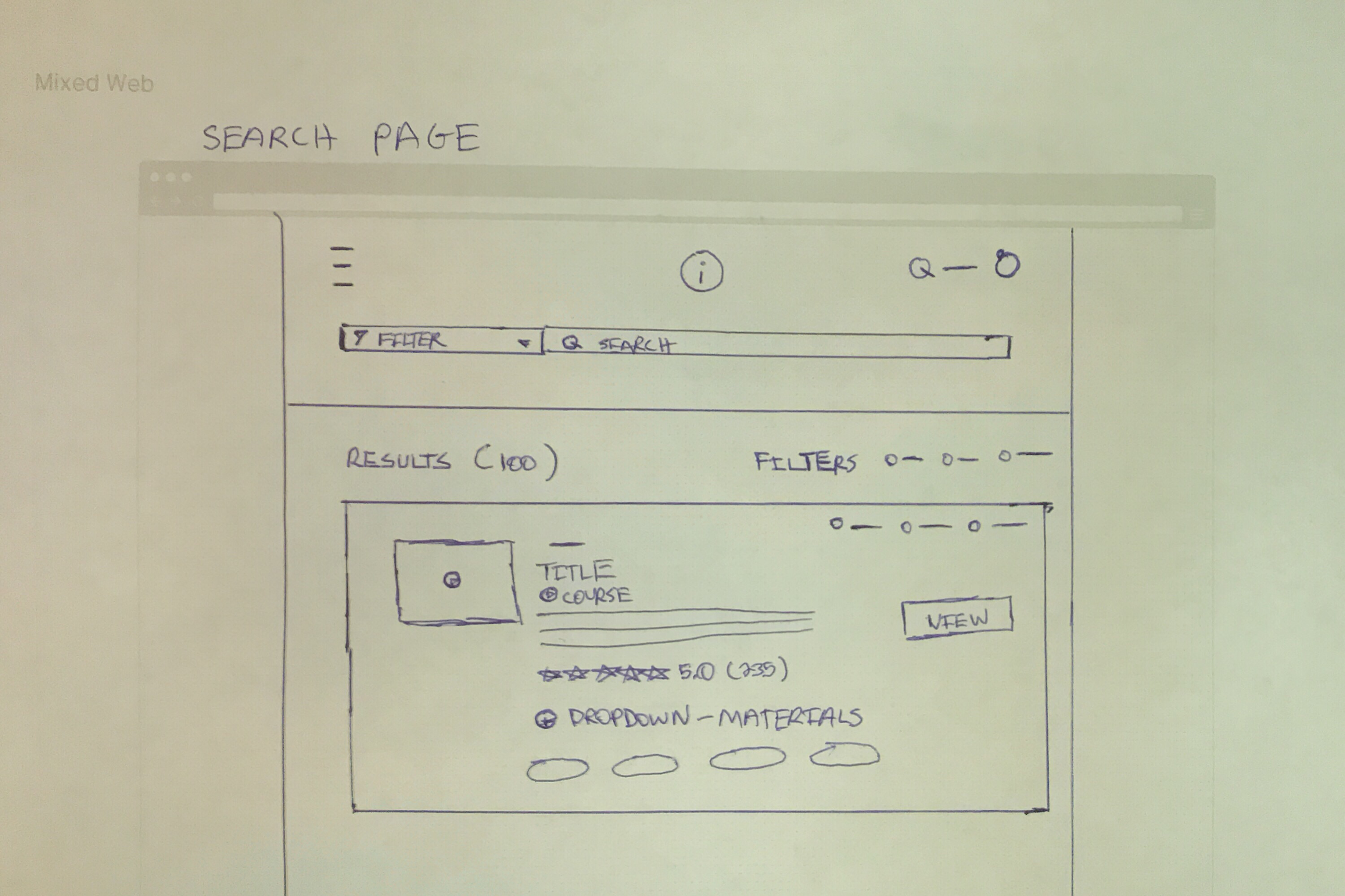
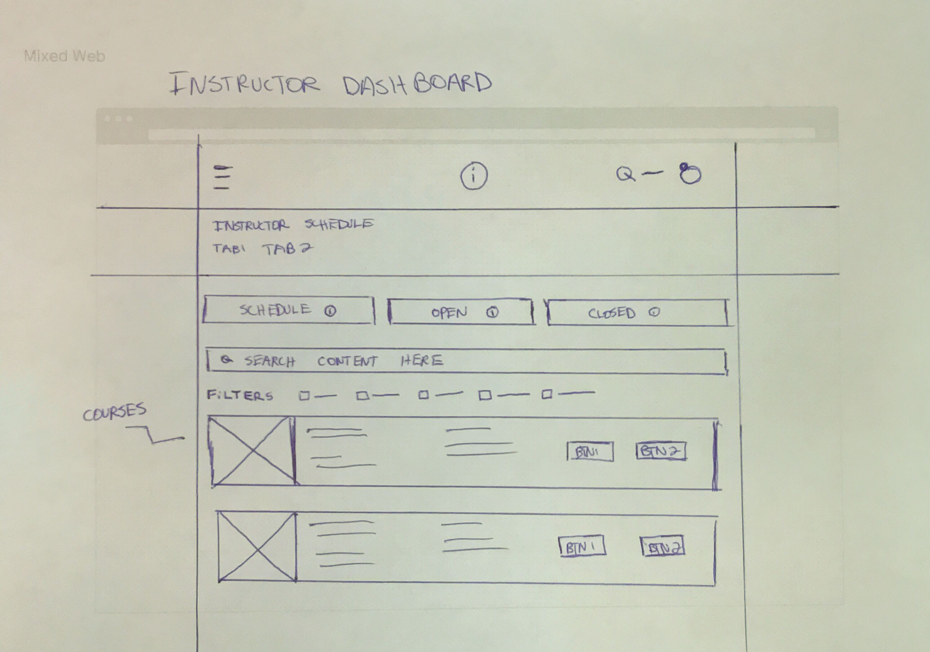
Another important aspect of the design process is creating low fidelity wire-frames. This allows me to get the structure of a project in my design programs without having to worry much about colors, typography or the final touches quite yet... I have found wireframes to allow me to become very efficient throughout my process.
This is the part of the design process where the visual design is completed. This is where I find out my visual design languages, solidify my desired color scheme, typography, iconography and the overall look and feel of the project. Due to the sheer amount of artboards I'd have to post, I decided to create a video displaying the entire flow of each of my projects while using Adobe Experience Design.
Whenever I complete a project, I always perform a usability test with a few people and gather their feedback. Even for personal concepts so that I can see where users do well and where they tend to struggle. People will often times help me find a better solution immediately. Feedback and criticism has always helped me improve not only in design, but in all aspects of life.


H-E-B Instructors in Austin, Texas were stoked to finally have a grading system online. Previously everything was handled through paper.
Users felt that the "My Profiles" were a big improvement from the previous version.
Users preferred the lighter UI over the dark one.
Rating System was nice because previously there was no way to tell if an Instructor was competent or not. It was only via word of mouth.
Research and Competitive Analysis was greatly appreciated before starting this project.
Users really liked having their badges displayed on their profile. Much easier to access than on the old design.
The iDevelop Logo needs to align more with H-E-B. The logo tends to make users feel entirely separated from the company.
For a partner registering "Enroll Now" should have a way to find a location directly.
Verbiage changes based on user feedback that were confusing to some.
Needs a state to handle Student Partners with an invalid ID.
iDevelop will need to keep up with the design language of heb.com and digital.heb.com in the future to make it feel connected. Currently it is using a modified version of Google Material Design.